Design is supposed to make life easier. Safer. More intuitive. At its best, good design disappears into the background and simply works. At its worst, it actively puts people in danger.
What’s unsettling is that many dangerous design failures are not the result of advanced engineering problems or unpredictable circumstances. They come from ignoring how humans actually move, think, and behave.
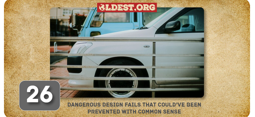
Below are 26 dangerous design mistakes from public spaces, buildings, infrastructure, and everyday products that could have been avoided with basic common sense.
1. The “Distracted Driving” Distraction
Source: Reddit
This pop-up warns you that taking your eyes off the road could lead to “injury or death,” yet it requires you to, you guessed it, take your eyes off the road to read the three-line paragraph and find the “OK” button to make it go away.
2. The High-Speed Collision Course
Source: Reddit
By hanging two swings directly across from each other on the same narrow frame, the designer has essentially created a low-budget particle collider for toddlers.
3. The Car Crusher 3000
Source: Reddit
Usually, when you pay for a stackable parking lift, you’re looking to save space, not turn your SUV into a convertible. It’s a rare two-for-one deal: you lose the bottom car to water damage and the top car to a sudden, violent encounter with architecture.
4. A Very “Sour” Trip to the ER
Source: Reddit
Nothing says “common sense” like putting a chemical-filled sphere inside a package that screams “deliciously sour.” It’s a design fail that turns a relaxing bath time into a high-stakes guessing game for anyone under the age of ten.
Moments like these highlight how everyday blunders become unintentionally funny, much like the scenes captured in our collection of ineptitude photos.
5. The “Wake Up Call” You Didn’t Ask For
Source: Reddit
Thanks to those pointed ceramic ears perfectly aligned with a human’s face, every morning becomes a high-stakes game of “Don’t Poke Your Eye Out.” It’s a design that forces you to choose between your caffeine fix and your depth perception.
6. The Parisian Pothole Paradox
Source: Reddit
Cycling through Paris is usually considered romantic, but this bike lane is more of a tragedy in the making. Someone thought it would be a great idea to install safety bumps to divide the lane, only to immediately cover them in the exact same white paint used for the road markings.
7. The Self-Destructing Stylist
Source: Reddit
A hair dryer has one primary job: get hot enough to dry your hair without becoming a fire hazard. This particular model, however, seems to have missed the memo on heat resistance.
8. The “Amputee” Ceiling Fan
Source: Reddit
It’s a bold architectural statement that says, “I value this wall more than I value physics or my own safety”. Instead of a breeze, you get a rhythmic, mechanical thumping.
9. The Accessibility Paradox
Source: Reddit
Someone clearly saw a blueprint that called for a ramp leading to the door, and they followed those instructions to the letter, forgetting that the ramp actually needs to start at ground level to be effective.
10. A Structure Held Together by Hopes and Dreams
Source: Reddit
Usually, when you see a massive steel support beam designed with twelve pre-drilled bolt holes, the general architectural consensus is that you should probably use twelve bolts. This installer, however, seems to be a firm believer in the “less is more” philosophy.
The warmth and charm many people love today can be traced back to traditional layouts and materials, which explains why older homes feel cozier compared to modern designs.
11. The Traffic Light Snow Globe
Source: Reddit
Because the snow has nowhere to drain, it simply piles up until the lights are completely buried. It turns a busy intersection into a high-stakes game of “Guess the Color” or, more accurately, “Just Hope Everyone Else Stops Too.”
12. The Garage of Broken Dreams
Source: Link
Most garages are built for storage, but this one was clearly designed for a very specific type of thrill-seeker. By replacing a solid driveway with two narrow, unsupported concrete beams over a massive drop, the architect has turned “parking the car” into a high-stakes balancing act.
13. Shocking Lack of Effort
Source: Link
If you’ve ever wondered what an electrical fire looks like in its awkward teenage phase, this is it. Instead of actually wiring a new outlet, someone decided to just “bridge the gap” using what appear to be three long, exposed metal screws.
14. The Industrial-Strength Plastic Melt
Source: Reddit
If you’re installing an industrial-strength heater, common sense suggests using materials that can, well, withstand industrial-strength heat. Instead, someone opted for a plastic vent cover that appears to have the melting point of a lukewarm marshmallow.
15. For The Visually Impaired
Source: Reddit
Tactile paving is a brilliant invention designed to help blind and visually impaired people navigate public spaces safely. However, that safety usually depends on the path not having a waist-high metal hurdle bolted directly across it.
16. The Cycle-Slaying Sewer Grate
Source: Reddit
Most bike lanes are designed to keep cyclists away from traffic, but this one seems designed to send them directly to the orthopedic surgeon. Someone decided to install a sewer grate with bars running parallel to the direction of travel, the perfect width to swallow a bicycle tire whole.
17. The “Extreme Sports” Wheelchair Ramp
Source: Reddit
Placing a handicap-accessible sign at the bottom of what is essentially a vertical wooden wall is peak design irony. It’s less of a helpful path and more of a “choose your own adventure.”
18. The “Shocking” Irrigation Strategy
Source: Reddit
Usually, the universal rule for high-voltage electrical boxes is to keep them as far away from water as possible. This landscaping genius decided to throw that rule out the window by aiming a high-pressure lawn sprinkler directly at the door seams of an electrical cabinet.
Many widely accepted facts turn out to be wrong, as shown by these common historical misconceptions that challenge what we think we know about the past.
19. The Forbidden Licorice
Source: Reddit
It is a masterpiece of mixed signals: the name says toy, but the branding screams “high-fructose snack.” If you’re going to sell a non-edible product that looks exactly like gourmet taffy, maybe don’t use the word “Candy” in a font size larger than the choking hazard warning.
20. The Toilet-to-Table Branding Blunder
Source: Reddit
Despite having completely different functions, the “Bowl Buster” Toilet Cleaner and the “Mint & Lime Time” Dish Liquid use identical teal bottle shapes, identical white flip-caps, and nearly identical font layouts. You’ll need to read the fine print very carefully every single time you reach under the sink.
21. The “Forbidden Protein” Pre-Workout
Source: Reddit
With its white tub, red lid, and aggressive “MECHANIX” branding, this packaging looks exactly like a high-performance protein powder found at a local supplement shop. In reality, it is Caustic Soda.
22. The Finger-Frying Soldering Iron
Source: Reddit
This particular model features a design flaw that turns a standard tool into a literal hot potato: a metal screw is located exactly where your index finger rests for precision work, one directly connected to the internal heat source.
23. The “In Case of Emergency, Please Bring an Axe” Exit
Source: Reddit
While the door still proudly wears a “Do Not Block” sticker, someone decided the best way to deal with a broken exit was to board it up with a solid sheet of plywood.
24. The Beachside Griddle
Source: Reddit
On a day when the temperature hits 31°C, this bench isn’t a place to relax, it’s a physical hazard. Without any shade or cooling material, the metal surface likely reaches temperatures high enough to cause a literal “burning surprise” for anyone wearing shorts or a swimsuit.
25. The Posture-Correcting Metro Bench
Source: Reddit
Instead of leaning back to relax while waiting for the train, commuters are forced into a permanent, awkward slouch to avoid a literal “concussion by design.”
26. The Electric Eel Shower Experience
Source: Reddit
Mixing high-voltage electricity with a high-moisture environment is usually the first chapter in a manual on what not to do, but this bathroom setup ignores that advice entirely.
Final Words
Good design starts by asking simple questions. How do people move? Where do they rush? Where do they panic? Where do they slip, trip, or misjudge? When designers forget those questions, everyday spaces become quietly dangerous. And when common sense is ignored, people pay the price and these are some of the perfect examples of just that.
The post 26 Dangerous Design Fails That Could’ve Been Prevented with Common Sense appeared first on Oldest.org.